One morning a short while ago (before Covid-19 struck) I was waiting in my bank branch for an appointment. I’d scheduled to be there early and so I was one of a small number of customers waiting when the security guard opened the door.
A senior woman in front of me went to take a number from the touchscreen display just by the entrance. To my surprise, she opened her ID card wallet and held it against the screen.
The week before I had renewed my ID card, and got the new biometric type which is now standard in Israel. As I watched the woman ‘tap’ her ID card on the screen, I thought approvingly of the added ease of getting a number, and that the woman had adapted rather easily to the new innovation.
As I observed from afar, I noticed that she was having some difficulty. So when she turned around to find some help, I was ready to offer.
“I don’t know why it keeps asking me for my passport number”
She said as I approached. Facing the screen, she touched the ‘back’ button and tried again, placing her ID card on the screen as before.
“Ok, it’s working now”
She said as she happily entered her ID number via the on-screen number pad.
Now it was my turn to be confused. Why would she need to enter her ID number manually if the display uses RFID (Radio-frequency identification)? In addition, I’d realised that she’d been using the old type of ID card, one that doesn’t include a chip with biometric data.
What was going on?
As I approached the stand for my turn, I realised what had happened.
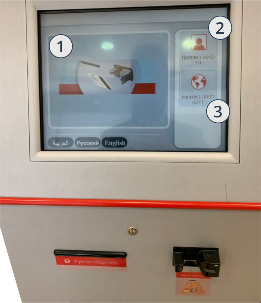
The screen showed three options for identification:
- Swipe bank card
- Enter ID number
- Enter passport number
The most prominent by far was the option to swipe a card (#1). This took up the majority of the screen real estate and included an animation. Options #2 and #3 were in a secondary position and had only subtle indications that they were buttons.
So instead of simply tapping the area with a finger, the intended interaction, the woman understood that it was necessary to place the ID card directly on the screen. In the process, she had accidentally, and unknowingly, touched the option for entering her passport number with her thumb. The result was that she had got to the ‘wrong’ screen.
Analysis
There are a few interesting points in this interaction.
Affordance
First up, affordances. The element the user interacted with was element #2. Neither this nor element #3 afford (suggest) tapping or pressing. They do have a slight bevel effect, but this wasn’t enough to for the user to understand the intended interaction. When the visual design of an element doesn’t match it’s functionality, users are likely to ‘get it wrong’.
In addition, the button was a similar size to an ID card. Another false indicator as to the intended interaction.
Unfortunately, I didn’t ask how the user understood the interface, a missed opportunity!
Error
Although it was a slip that made the error apparent (the user accidentally touched the passport button while trying to place her ID card on the ID button), the interaction was actually a mistake. The screen doesn’t support RFID. The user’s mental model was at variance with the system model, and the interface did little to make the system model clear.
For more information on slips and mistakes, check-out the short video on Slips and Mistakes from Nielsen Norman Group, and if you’re really interested, here’s Don Norman’s original paper on Errors in Human Performance
(Nielsen Norman Group also have a some good advice about preventing slips and preventing mistakes)
Willingness to embrace technology
I found it really interesting that the user assumed the RFID functionality. RFID support is relatively new in Jerusalem, where this took place. The light railway and buses have all had RFID for a couple of years, but at present it only works with the smart card specifically for public transport, and not a credit card. In shops, one almost universally hands one’s card to the cashier to swipe. This was a reminder that senior users are not necessarily behind others in adopting new types of interaction and technology.
Expect the unexpected
As the technology we use becomes more and more commonplace throughout everyday life, the opportunities for learning about users are literally everywhere; going out is like one big contextual study!
People are inventive and creative in ways that we might never expect, that’s what makes UX design so interesting, and why research and testing are so critical to good design.
All comments and feedback gratefully accepted!
Comment on LinkedIn