Introduction
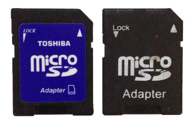
After borrowing a couple of microSD card adapters from a friend, I noticed some small differences in the labelling for the lock functionality. It started me wondering how good a choice either of them were for the functionality they supported… I had my suspicions. A few short user tests later, and my suspicions were confirmed – the labelling is insufficient to make the lock functionality understandable or usable without trial and error.
In this article I’ll summarise the user tests, analyse the results, and suggest a better solution.
Research Details
Technique
User interview
Participants
6 participants with varying levels of experience in computer and digital camera usage.
Questions
- How does one lock the adapter?
- What does the ‘lock’ feature do?
Method
In the interview I showed the participant one of the microSD card adapters and asked them each of the above questions. I then showed them the other adapter and asked whether it supported their answer and if it was a better design than the first one.
Results
How does one lock the adapter?
- 50% of participants answered ‘down’ – the correct answer.
- Reasons given for answer
- Down is the normal position for ‘lock’
- Arrow points down
- 50% of participants answered ‘up’ – the incorrect answer
- Reasons given for answer
- Up is the normal position for ‘lock’
- The word ‘lock’ is written at the top of the slider area
- Arrow looks like a volume control (Toshiba adapter) – more at the top
What does the ‘lock’ feature do?
Participants gave a range of answers:
- The card can’t be used (3 answers)
- The card can’t be erased (2 answers)
- Keeps micro SD card in adapter (1 answer)
In fact, locking the card stops files being written to, or deleted from, the card. However, it does allow data to be read from the card. So none of the answers were fully correct.
Analysis
Question #1 – method of use
As can be seen from the answer to the first question, the labelling on the MicroSD card adapter is completely inadequate to allow the user to use it successfully. For such a supposedly simple task, a 50% success rate is well below an acceptable threshold. In fact, a 50% success rate could be expected if the answers were simply given at random.
Moreover, some of the reasons for success were based on intuition, and not on the labelling (‘normal’ position answer), while that same intuition lead half of the users to the wrong answer!
If we look at the signals provided in the labeling we can see that in two of the three cases the signal itself lead to the incorrect understanding:
- Text label position
- The word ‘lock’ is positioned at the top of the toggle area, when in fact the toggle handle needs to be in the down position to apply the lock
- Arrow shape
- On the Toshiba adapter, the arrow looks like a volume control with the ‘loudest’ at the top leading to the misunderstanding that ‘up’ is for lock
- Arrow direction
- When recognised by the participant, this is the only signal that leads to the correct understanding (non-Toshiba adapter).
Question #2 – result of locking
When it comes to understanding the result of activating the lock, the success rate is even lower. Only 1/3 of participants came close to understanding the result of locking the microSD card adapter.
Competitors
A review of competitors shows some slight variation in approach. SanDisk’s adapter and Lexar’s SD card labeling ignore the lock functionality all together, while Adata uses text and the ‘volume’ arrow similarly to the Toshiba adapter used in the test.


Two examples of where labeling is more closely mapped to the functionality is on Transcend and SanDisk SD cards.
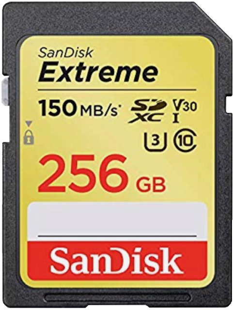

The Transcend design has the lock placed in the middle and the arrow is used to indicate the direction to apply the lock. SanDisk SD cards, which has the lock at the bottom with the arrow above pointing down to it, is the clearest of all.
A better option?
The designs used by some of the competitors above may solve the problem of how to apply the lock, but none of them address the issue of what locking the card actually does.
A better solution would be one where the ‘how’ and ‘what’ are both clearly communicated to the user. Making use of ‘editable’ and ‘not editable’ icons does just that.
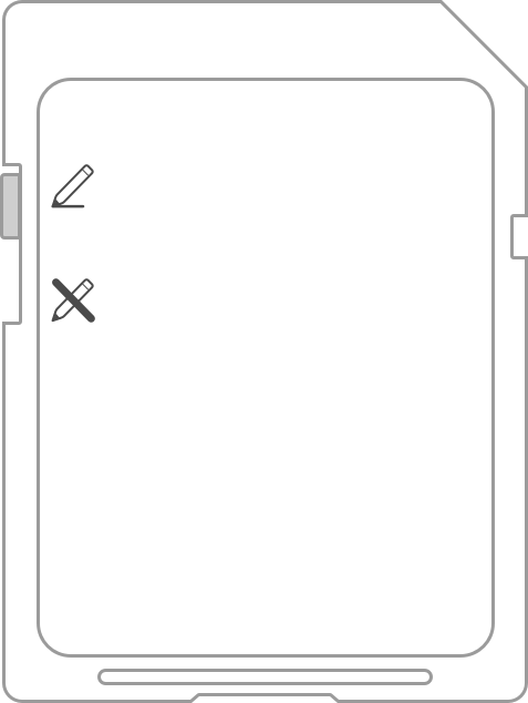
In the suggested solution, a pair of icons are used to show the ‘how’ and the ‘what’ simultaneously. The ‘editable’ and ‘not editable’ icons are in common use, and are readily recognised and understood. This was confirmed by some user tests.
If the user understands that sliding the toggle down means that the card content may not be edited, we remove the need for the whole idea that the card is ‘locked’.
Take Aways
- Slight changes in the position of visual elements can have a big influence on the message they communicate.
- Mixing paradigms can lead to confusion, or lack of clarity, for example, the ‘volume’ arrow.
- The most common convention is not always the best.
Even supposedly simple features and interactions can be misunderstood by users. User testing is the key to discovering the issues, and fixing them allows us to build better and more successful products.
After Thought
Now obviously, this study is too small to draw conclusions from the quantitive results. However, the qualitative results are interesting.
If anyone would like to run a similar study, I’d be happy to compile the results, please be in touch!